←
All Articles
Web Design • Conversion

What makes a high-converting website?
Good design isn’t just about making a website look impressive. It’s about helping the right person understand what you offer and what they should do next.

Clemence Kotoku
4 min read
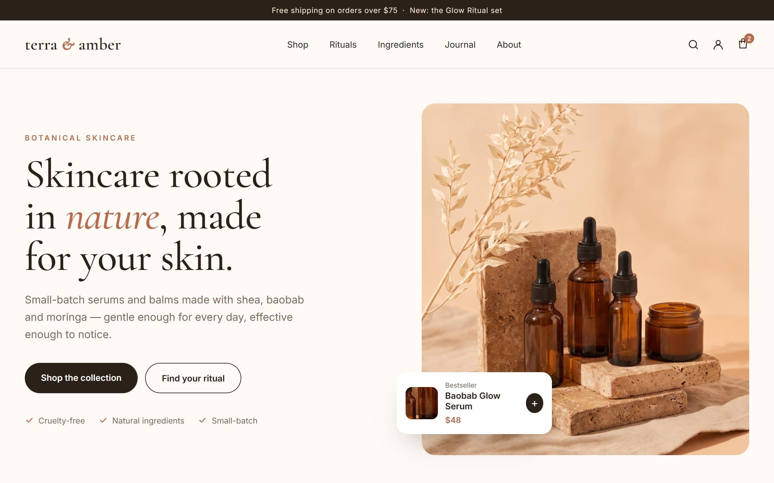
“High-converting” gets thrown around a lot. Agencies promise it, templates claim it and every landing page builder puts it in the headline. It usually means one thing in those conversations: a website that looks modern.
But conversion has very little to do with looking modern. A high-converting website is one that helps the right person understand what you offer and decide to take the next step. That is it. Everything else is in service of that.
Here is what I pay attention to when I design a website that has to perform, not just impress.
1. It is built for one kind of person
The fastest way to lower conversions is to write for everyone. A website that tries to speak to every possible customer ends up speaking to none of them in particular.
Before I design anything, I want to know who the website is really for. What do they already know? What are they worried about? What would make them choose this business over the one they looked at five minutes ago? When the page answers those questions directly, it feels like it was made for the visitor, and people act on things that feel made for them.
2. The first screen does the heavy lifting
Most visitors decide whether to stay within a few seconds, often before they scroll. So the top of the homepage, and of every landing page, carries more weight than anything below it.
A strong first screen does three things:
- Says what you do, in plain words a customer would use, not internal jargon.
- Says why it matters to the person reading, the outcome they get rather than the features you have.
- Shows the next step, one clear action, visible without hunting for it.
If a stranger can’t repeat back what your business does after glancing at that screen, nothing further down the page will save it.
3. There is one main action
Give people five buttons and they often click none of them. A high-converting page has a primary action and makes it easy to find: book a call, get a quote, shop the collection, start a free trial.
Secondary actions are fine, like reading a case study or viewing pricing, but they should look secondary. When everything is emphasised, nothing is.
Clarity converts better than cleverness. If the visitor has to think about what to do, you have already lost some of them.
4. It removes doubt before it becomes an objection
Every visitor arrives with questions. How much does it cost? How long does it take? Will this work for someone like me? What happens after I click the button? Each unanswered question is a small reason to leave.
Good websites anticipate those questions and answer them in the flow of the page. Real project examples. Specific results. A simple explanation of the process. Reviews from actual customers. A short FAQ near the call to action. None of this is decoration. It is the part of the conversation a salesperson would normally have, written down.
5. It is fast and it works on a phone
This sounds obvious, and it is still where many websites lose people. Most visitors will see your website on a phone, often on a slow connection, often while doing something else. If the page takes too long to load, if the buttons are hard to tap or if a form asks for ten fields on a small screen, conversions drop before anyone reads a word.

I design and test for mobile first because that is where most of the decisions actually happen.
6. The design supports the message
Design matters, but its job is specific. It should create trust, guide attention and make the message easy to follow. Consistent typography, generous spacing, strong contrast on buttons and real imagery all help. Busy animations, sliders that hide the important content and walls of stock photos usually don’t.
The question I ask about every design decision is simple: does this help the visitor understand and act, or does it just look nice to us?
7. It is measured and improved
A website is never finished on launch day. The highest-converting sites I know are the ones someone keeps paying attention to. Which pages bring in enquiries? Where do people drop off? Which traffic sources send buyers and which send browsers?
With proper analytics and conversion tracking in place, those questions have answers. Then improvements stop being opinions and start being decisions: test a new headline, simplify a form, move the proof higher, rewrite the offer. Small, measured changes add up.
The short version
A high-converting website is clear about who it is for, says what you do in seconds, makes one next step obvious, answers doubts before they become objections, works beautifully on a phone and gets better over time because someone is watching the numbers.
Looking impressive is a bonus. Being understood is the job.
If you want your website to do more of that job, have a look at how I approach website design and development, or get in touch and tell me what you’re working on.
Written by
Clemence Kotoku
Web designer, developer and digital marketer. I build websites, digital products and systems that help businesses grow, and I write about what I learn along the way.
Working on something?
Let’s make your website do more.
Tell me what you’re building or improving, and I’ll come back with the right way forward.
Share this article
Keep Reading
More from my desk.

Websites • Marketing
Your website is useless. Let me explain why.
A website doesn’t make sales simply because it exists. Here’s what actually needs to happen before your website can contribute to growth.

AI • Productivity
5 AI tools I’m actually using in my workflow
There are thousands of AI tools available. These are some of the ones that have actually found a place in my day-to-day workflow.
Building • Product
What building products has taught me about websites
Working on my own products has changed the way I think about designing and developing websites for other people.
Let’s Connect
Have something you’re trying to build?
Whether it’s a website, a campaign or a product idea, I’d love to hear about it. Start with the problem. We’ll figure out the rest together.